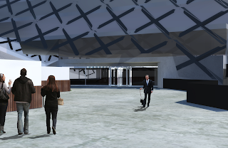
The below images show how the building would look in the real context of Brisbane city.
The first image shows the connection to the Queen street mall.
The second image shows the connection to Elizabeth street.
The third image shows the integration with the myer centre.
Thursday, 8 November 2012
First Person Experience
First person experience was an important part of the criteria for this assignment. I have looked at how a person will experience the space as they go through it, and it can be seen below. All images are marked with the location they are taken from.
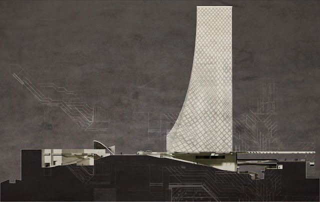
Elevation
The elevation below is from the eastern side of the building, from along Elizabeth street
It shows the opening of the public space onto Elizabeth street. As can be seen the opening is quite large and I feel is enough to continue the public realm into the building.
Sections
The sections in the building I feel capture the feel of the space. They highlight the changes in level and the angularity of the Nanobris centre, as well as the shadowing of the space.
The lines to the bottom of the section are the floor plan leading up to the section cut. The lines above the section are the roof plan of the Nanobris centre.
Section B - B below cuts through the main community street of the space and looks to the east.
Section A - A below cuts through the main foyer of the space and looks to the north. The cut was selected to shoe the maximum detail of the space.
The lines to the bottom of the section are the floor plan leading up to the section cut. The lines above the section are the roof plan of the Nanobris centre.
Section B - B below cuts through the main community street of the space and looks to the east.
In much the way as Section B - B the lines above the section are the roof plan of the Nanobris centre.
Floor plans
Firstly the site plan shows the green spaces that are beginning to form on the streets of Brisbane are being incorporated into the Nanobris Centre. The site plan also shows how the roof plan highlights the original concept of the building, creating a pattern that represents movement through the space. North is towards the top of the page on all of the plans.
The second floor plan shows more of the retail spaces around the ramp the surrounds the atrium in the main area of the public space.
The third floor plan shows the bar area and the beginnings of the ramp going over the space.It also shows the family spaces, the garden space, the reflection space and the maglev station.
The first floor plan shows the connections to both George Street and the southern end of Queen Street. It also shows the retail spaces around the walkways.
The second floor plan shows more of the retail spaces around the ramp the surrounds the atrium in the main area of the public space.
The third floor plan shows the bar area and the beginnings of the ramp going over the space.It also shows the family spaces, the garden space, the reflection space and the maglev station.
Masterplan
The masterplan below shows how the Nanobris centre fits into the city of Brisbane. The maglev line is highlighted in blue and the greenery on the streets represents the conversion of the streets into pedestrian green space, as was discussed in assignment 1.
"The streets of Brisbane are no longer used for vehicles, and are therefore converted into pedestrian spaces, incorporating large amounts of greenery that is missing in 2012 Brisbane. The maglev line runs through and
around the city, allowing for people to commute from one side of the city to the other quickly and for free. There is a maglev stop incorporated into the Nanobris centre, making the centre easily accessible from anywhere in the city. Pedestrian flow is optimised through the centre. By travelling over the myer centre commuters can travel from one side to the other faster. Connections to Queen street, Albert street, George street and Elizabeth street opens the centre to all potential users"
The red lines indicate the flow of pedestiran traffic through the Nanobris Centre.
Nanobris.
The name of this development will be Nanobris. The overall public realm will be know as the Nanobris Centre and the Tower will be known as the Nanobris Tower.
Maglev Train Station
Maglev trains are a very quiet, sustainable and low maintenance public transportation system. In 2032 the city of Brisbane will have a Maglev track running around the edge of the city. The Nanotechnology centre holds one of the stations for this track.
As Brisbane has developed, the public transport system has been upgrade to where it is now free for all commuters. Because of this, the Maglev stations do not require any form of ticket office, allowing
commuters to freely go about their day after disembarking. The station and the location of the station can be seen in the image below.
Space Activation - Coffee Stall
There is also a coffee stall that is a part of the space. This is placed at the top of the the public space between the Maglev station and Queen Street mall. The location of this can be seen in the image below.
Space Activation - Reflection
There is a space for reflection that overlooks the garden space and down onto the queen street mall. The idea of this space is to provide the user with some separation from the the city while still overlooking it. By taking the user out of and above the space it gives them the oppurtunity for a quiet moment of reflection. Or they can simply enjoy the view.
Space Activation - Family Space
By provideing spaces for families to use, the public space will help the community develop and become a major part of the new Brisbane residential community as it continues to develop. There are family spaces located on the top of the space, converting the tops of existing buildings into green spaces that include trees and a BBQ area. The railings of these spaces have been designed to appear as if they are not there when viewed directly on, to give the illusion that the space continues indefinitely. The location of the space can bee seen below
The space can be seen in the image below
The railing details can be seen below
Space Activation - Relaxation
One of the spatial activators is a simple relaxation space, with the idea behind it taken from the image below.
The space is a simple astroturf material laid over a foam bed on a sloping ground in the shade, giving people a place to rest and relax. The space and its location can be seen in the image below.
The space is a simple astroturf material laid over a foam bed on a sloping ground in the shade, giving people a place to rest and relax. The space and its location can be seen in the image below.
Space Activation - Community Pool
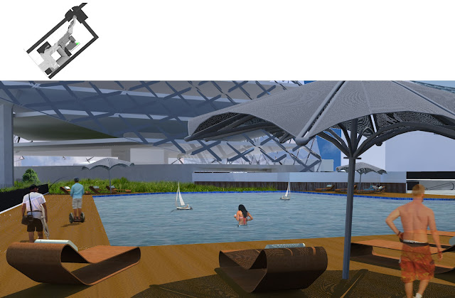
At the top of the public space there will be a community pool to activate the space, and provide something that is currently lacking in Brisbanes CBD. The main reason behind the placement of a pool in the space is to connect the space with the identity of Queensland and its beach culture. While the pool has not been designed as a beach, it has been designed to reflect the characteristics of Queenslands beaches. The major one of which is the accessibility of the beach, and the sun. The space has no barrier between the public space and the water, in much the same way that southbank does. There is a shade cover over a part of the pool, which is designed to relfect the Nanotechnology tower. This serves to link the spaces together.
A large part of the area is also uncovered. Shade is provided to those who would like it through the use of umbrellas over day beds, and a large shading structure over the food court area. The pool area can be seen below.
Space Activation - Garden
The next space activator that is included in the public space is a large garden, which includes multiple garden beds, a water feature and a green wall. The space is designed to provide a place where people can escape the city and relax. The green wall and the water feature help to reduce the heat of the space. The space and its location can be seen below.
Space Activation - Bar and Restaurant
The first insertion into the public space to activate it is a bar and restaurant. The style of the bar will be slightly different to what is currently found in Brisbane, and is modelled of the establishments found in the Salamanca district in Hobart. During a recent trip there I found the the bars in the area had a very different feel to those in Brisbane. while they are focused on drinking, food can be ordered from the bar and the overall feel is slightly more relaxed and formal then what is found in Brisbane.
The bar will have no roof, other then the roof of the overall space, leaving it open to the views of people using the walkways of the public area. The space will be lower then the walkways, and will consist of 3 tiered levels with the walls angled slightly outwards, to break the harsh feel of the recessing. To make the space feel more relaxed and conducive to drinking and eating, the walls of the space will be lined with timber beams, with the potential for vines to grow over them, changing the feel of the space over time.
The two bar areas will be set into the existing myer centre, and will use a rounded shape to seperate themselves from the rest of the space. The bar can be seen in the images below
The top image also shows a large window in the myer centre over the bar that helps to link the 2 seperate spaces that occupy the block. There is also and entrance to the myer centre just to the right of the bar entrance, which can be seen in all 3 images.
Materials
The materials of the space are important in creating the mood of the space. The unique design of the roof will cast shadows onto the floor that will change the feel of the space over the course of the day. The materials of the space will need to reflect that.
As said before, the roof will be made from Danpalon. The fins of the roof will be made from Carbon Nanotubes, to reduce the structure that will be required to support it, and to keep the with down.
The floors of the space will be made from polishded concrete and the walls from preset concrete slabs, that are pured offsite. Because of this they will not have the reinforcing marks that are generally associated with concrete. They will also not be solid concrete walls, which will reduce the weight of the structure. The walkways will use the same materials, but reinforced with Carbon Nanotubes, to allow the structure to span the gap of the central space. This offsite pouring of concrete has been successfully used on building, including the Tel Aviv Museum of Art by Preston Scott Cohen. The building can be seen here (http://www.pscohen.com/tel_aviv_museum_of_art.html) and the effect will be similar to this building, which can be seen below.
The effect that the concrete and light will create will be similar to the work of Tadao Ando. The effect can be seen in the image below, which shows the main atrium in the space, which is surrounded by ramps and retail spaces.
The shadowing would be softer at certain times of the day, when the sun is not angled directly down as it is in this image (Sun angle is at Brisbane on 31 January and 12:30pm)
Lobby Development
The lobby of the tower is important as it serves to connect the tower to the public, and as such is the first interaction that the public of Brisbane have with nanotechnology. Due to this it is important to have access to the public at two points, so that it is easy for them to enter wherever they are in the public space. The lobby has access on both the northern and southern edges, to allow for people to flow through the space in the same path that they would if the lobby was not there. this can be seen on the plan below.
The location of the lobby on the overall plan can be seen below
The location of the lobby on the overall plan can be seen below
The enternaces to lobby can be seen below. The doors are made out of glass to encourage interaction with the public, and not make the space feel as private. This can be seen in the 2 first person image below, however the glass does not appear as transparent as I would like
To highlight the public nature of the lobby a balcony has been created from the lobby over the public space below, creating a visual connection between the two spaces. This balcony can be seen below.
As seen in this image the balcony overlooks the bar area of the public space.
Subscribe to:
Comments (Atom)


