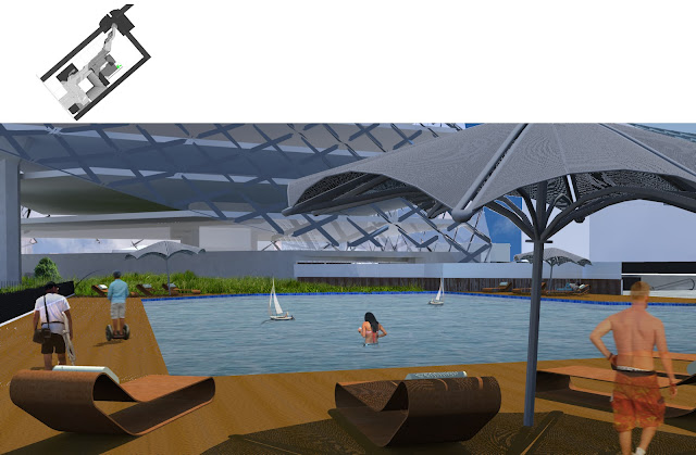
The below images show how the building would look in the real context of Brisbane city.
The first image shows the connection to the Queen street mall.
The second image shows the connection to Elizabeth street.
The third image shows the integration with the myer centre.
alexander william's architectural fiction
Thursday, 8 November 2012
First Person Experience
First person experience was an important part of the criteria for this assignment. I have looked at how a person will experience the space as they go through it, and it can be seen below. All images are marked with the location they are taken from.
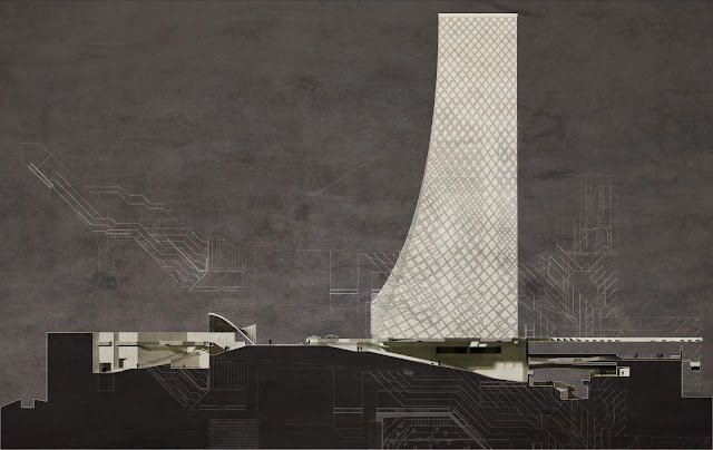
Elevation
The elevation below is from the eastern side of the building, from along Elizabeth street
It shows the opening of the public space onto Elizabeth street. As can be seen the opening is quite large and I feel is enough to continue the public realm into the building.
Sections
The sections in the building I feel capture the feel of the space. They highlight the changes in level and the angularity of the Nanobris centre, as well as the shadowing of the space.
The lines to the bottom of the section are the floor plan leading up to the section cut. The lines above the section are the roof plan of the Nanobris centre.
Section B - B below cuts through the main community street of the space and looks to the east.
Section A - A below cuts through the main foyer of the space and looks to the north. The cut was selected to shoe the maximum detail of the space.
The lines to the bottom of the section are the floor plan leading up to the section cut. The lines above the section are the roof plan of the Nanobris centre.
Section B - B below cuts through the main community street of the space and looks to the east.
In much the way as Section B - B the lines above the section are the roof plan of the Nanobris centre.
Floor plans
Firstly the site plan shows the green spaces that are beginning to form on the streets of Brisbane are being incorporated into the Nanobris Centre. The site plan also shows how the roof plan highlights the original concept of the building, creating a pattern that represents movement through the space. North is towards the top of the page on all of the plans.
The second floor plan shows more of the retail spaces around the ramp the surrounds the atrium in the main area of the public space.
The third floor plan shows the bar area and the beginnings of the ramp going over the space.It also shows the family spaces, the garden space, the reflection space and the maglev station.
The first floor plan shows the connections to both George Street and the southern end of Queen Street. It also shows the retail spaces around the walkways.
The second floor plan shows more of the retail spaces around the ramp the surrounds the atrium in the main area of the public space.
The third floor plan shows the bar area and the beginnings of the ramp going over the space.It also shows the family spaces, the garden space, the reflection space and the maglev station.
Masterplan
The masterplan below shows how the Nanobris centre fits into the city of Brisbane. The maglev line is highlighted in blue and the greenery on the streets represents the conversion of the streets into pedestrian green space, as was discussed in assignment 1.
"The streets of Brisbane are no longer used for vehicles, and are therefore converted into pedestrian spaces, incorporating large amounts of greenery that is missing in 2012 Brisbane. The maglev line runs through and
around the city, allowing for people to commute from one side of the city to the other quickly and for free. There is a maglev stop incorporated into the Nanobris centre, making the centre easily accessible from anywhere in the city. Pedestrian flow is optimised through the centre. By travelling over the myer centre commuters can travel from one side to the other faster. Connections to Queen street, Albert street, George street and Elizabeth street opens the centre to all potential users"
The red lines indicate the flow of pedestiran traffic through the Nanobris Centre.
Nanobris.
The name of this development will be Nanobris. The overall public realm will be know as the Nanobris Centre and the Tower will be known as the Nanobris Tower.
Subscribe to:
Comments (Atom)


